
So you have an SEO-optimized website that looks gorgeous on laptops and desktops?
Good job.
But does the website work well on mobile devices?
Google uses mobile-first indexing, meaning Google predominantly uses the mobile version of a site’s content for indexing and ranking. So, if your SEO strategy doesn’t cater to mobile users, your website may not even smell ranking.
The good news is that you can fix this.
In this article, we’ll discuss mobile SEO and show you how to optimize your SEO strategy for mobile users.
To Start With…What Is Mobile SEO?
Mobile SEO is the process of making the mobile version of your website – rank higher in search engines. This includes making your website easy to view, navigate, and use on smaller devices like smartphones and tablets.
And more importantly, the process requires making the mobile version of your website accessible to search engine crawlers. These spiders (or crawlers) are responsible for analyzing your website, indexing the content, and ranking the site on mobile search result pages.
In this era where more people use smartphones than desktops, every website owner must consider mobile SEO.
Here are some stats showing the growing trend in mobile device usage worldwide.
- Mobile usage makes up 53.59% of the global market share when comparing desktop to mobile and tablet devices.
- A recent study shows that the average person spends 3 hours and 15 minutes on their phone daily.
- A recent article by Broadband Search reveals that 98% of Gen Z (people born after 1997) spend over 4 hours daily on mobile devices.
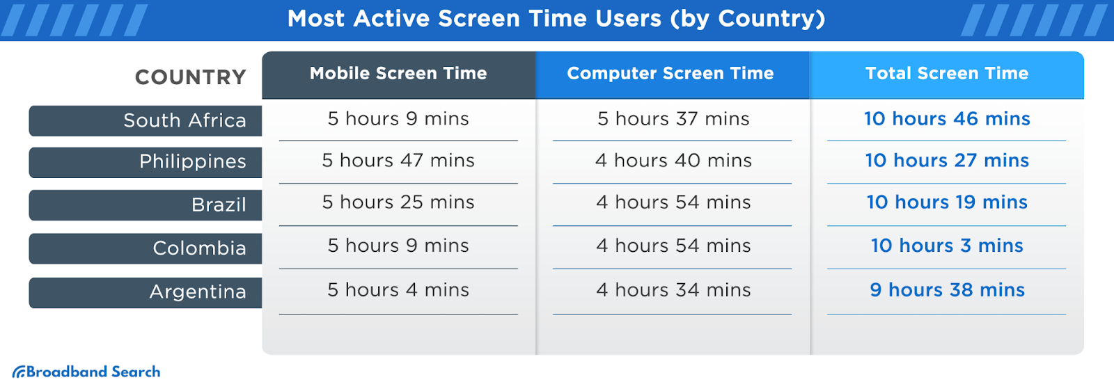
Image source: Broadband Search
With that established, let’s discuss how to cater to mobile users in your SEO strategy.
9 Ways To Optimize Your SEO Strategy for Mobile Users
Mobile SEO is not difficult.
You only need to do a few things to complement your existing SEO efforts, some of which include:
1. Allow Bots To Crawl Everything Necessary
Depending on the platform you use, check the Admin side of your website to access a “robots.txt” file.
This file specifies which pages and content you don’t want search engines to crawl or index. (i.e., blocked from the public)
See an example here:
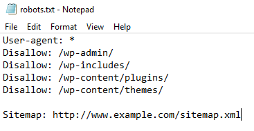
It’s fine if your site’s Robot.txt file has instructions to block out the Admin page, customer images folder, etc.
However, ensure your blog or articles section isn’t blocked. If it is, crawl bots won’t be able to crawl your blogs and rank your website in SERPs (Search engine results pages).
2. Use a Responsive Mobile Design
A website with a responsive design should work well across all platforms, including laptops, tablets, and smartphones. You don’t want a website that only works on desktop and is horrible on mobile.
Most popular website builders often have responsive designs coded into their templates. However, if your website isn’t functional on mobile, talk to your web designer.
P.S: If your website uses responsive design, Google recommends setting up a particular tag called “viewport meta tag.”
This tag helps to change the size of your website pages to fit each user’s device.
Whether your website already has the tag or not, Google recommends writing the tag this way: <meta name=viewport content=”width=device-width, initial-scale=1”>
And if you need a tool for testing the responsiveness of your website, check out this one here.
3. Reduce Popups
Ever had popups blocking your view while trying to read something online?
Yeah, it’s annoying.
While it’s less intrusive on desktops or laptops with big screens, popups can be a big turnoff on mobile devices. Even worse, Google once rolled out an update against “intrusive” popups.
So, tone down your popups for the sake of mobile users and to get better SEO rankings.
4. Optimize Titles and Description Tags for Mobile
When posting blog content on your website, you’ll need to provide a title and a description. Especially if you use WordPress to manage your website, and you have Yoast SEO installed, you have to provide meta descriptions for every article.
The general rule of thumb is to keep the descriptions and the titles relatively short.
However, here are the character limits that Google recommends:
- For Mobile: The title should be approximately 78 characters, while the description should be 155.
- For Desktop: The title should be approximately 70 characters, while the description should be 155.
While Google gives more characters to the Title tags on mobile, don’t let that trick you into writing longer titles. If your titles are too long, search engines may not rank them easily, or show snippets.
5. Show Content at Once to Mobile Users
Google and other search engines can’t crawl content that requires an action before being displayed fully.
Here’s an example of a webpage requiring visitors to click the “Read the rest of this article” before seeing the full content.
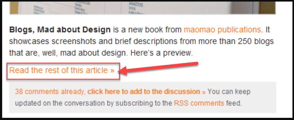
Image source: Smashingmagazine
This practice doesn’t help your SEO rankings, because search engine crawl bots would think such a webpage lacks content and they’ll abandon it.
6. Use Smaller Header Images
This is a user-experience hack for tidying things on desktop and mobile.

Image source: Nicepage
The above header image looks beautiful on desktop devices. But it can be an issue on mobile. Such a large image will shrink or become warped when viewed on mobile.
This is why you should use a smaller header image that displays clearly on mobile and desktop devices.
7. Make Your Content Easy To Read on Mobile
No one wants to pinch and zoom in on different parts of your website to get valuable information. So, ensure that the font of your website content is well-optimized for mobile users.
In fact, recent studies say that the average human attention span is 8.25 seconds. This means more people are likely to leave your website abruptly – if they encounter the smallest difficulty navigating your website.
You can significantly reduce your website’s bounce rate by making your content easy to read on mobile.
8. Put Social Share Buttons in a Tab Bar
Social share buttons make it easy for people on your website to share your content directly to Twitter, Facebook, Instagram, and other social media channels.
However, the screen estate on mobile is small; hence, there’s hardly any room for putting animated social share buttons. A smooth way to add these buttons is by putting them in a tab bar that doesn’t hinder a mobile user’s experience.
If your social share buttons are non-intrusive, more people will share your content on mobile, which in turn, improves your SEO ranking.
9. Optimize Your Page Speed on Mobile
Google recommends making your website load in under a second, which is a major SEO factor when ranking any website.
You can use the Google PageSpeed Insights tool to check your website’s loading speed on mobile. The tool will also provide recommendations to improve your website’s speed.
Here’s a scan result from the Google PageSpeed Insights tool.

Now, once you’re done optimizing your website for mobile SEO, you should also check if the website is mobile-friendly.
How To Check if Your Website Is Mobile-Friendly
We’ll recommend two methods to check if your website works well on mobile.
1. Check Manually on a Device
This is the best method, as it entails checking your website on an actual smartphone. Input the website’s URL on a mobile device browser and check for the following:
- How fast do the pages load?
- What functionality works fine?
- How easy is it to read the content on mobile?
- Are there disruptive popups that should be removed?
2. Use Google’s Mobile Usability Tool
The Mobile Usability tool is a cool feature on Google Search Console, and it helps you examine if your website is usable on mobile.
Here’s how you can use the Mobile Usability tool in 2 simple steps.
- Log into your Google Search Console and click the “Mobile Usability” option on the left menu.
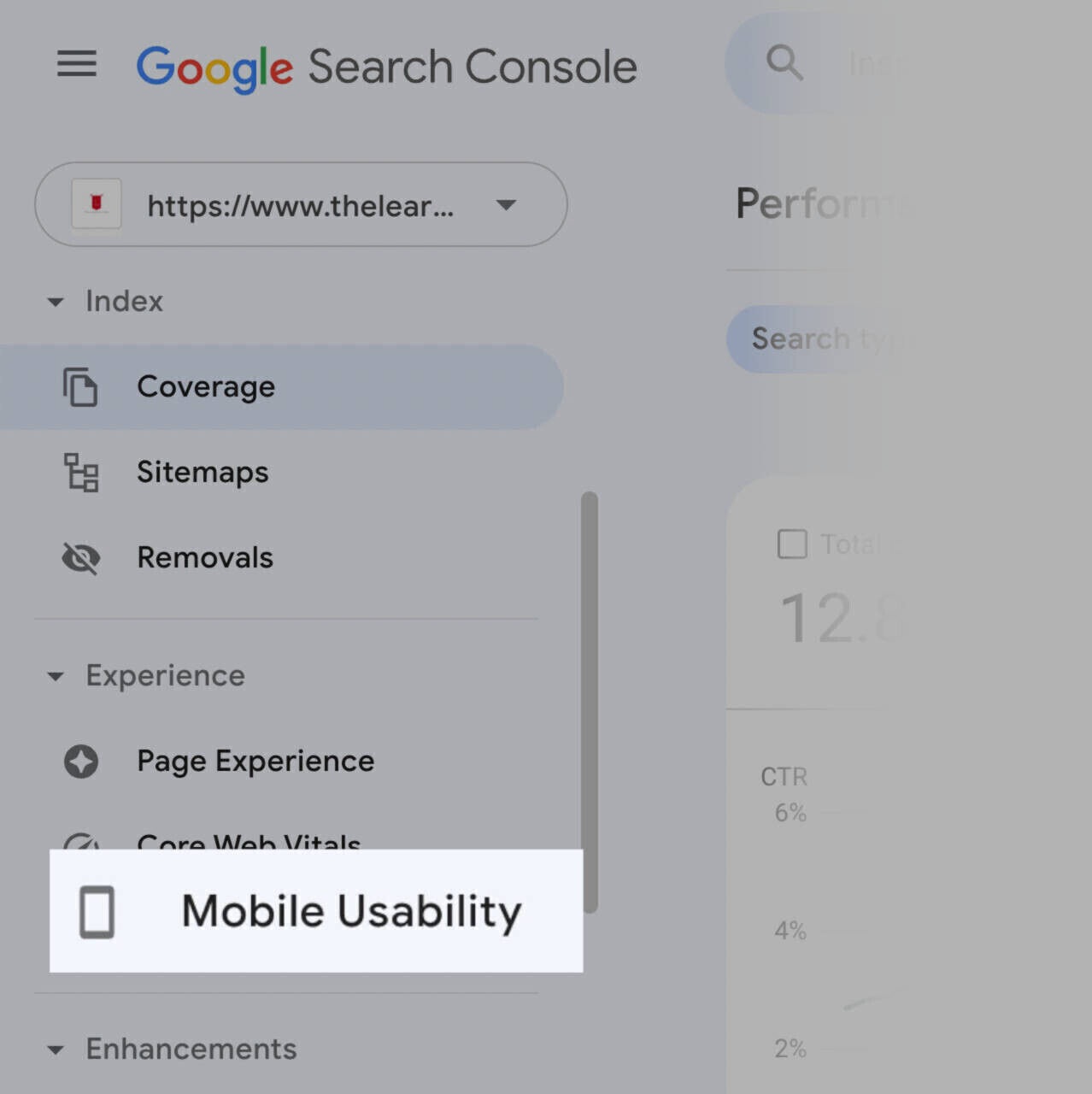
Image source: Semrush
- Check the information provided on the report screen. It should tell you what to fix and how many pages are affected. See the example below.

Conclusion on Optimizing for Mobile SEO
The best strategies for mobile SEO include crafting mobile-friendly content, optimizing for voice search, and using structured data.
In addition, ensure that the loading time of your website on mobile isn’t an eternity. Optimize your title tags and meta descriptions for SERPs on mobile.
If you can tweak your mobile SEO strategy using these simple tips, you’ll see a significant spike in your search engine rankings.
Leave a Reply